Nestor PeñaDesign Engineer · Product Designer

Identity system · v2

One identity for the site, the CV and every letter.

Tokens taken from the CV and cover letter, extended for screens. Use this page as the reference for any future document.

Color

One accent, used for the role title, section labels and proof numbers. Everything else is warm near-black and off-white. The accent has two strengths: accent for large numbers and graphics (3:1+), accent-text for small text (4.5:1+). Ratios are measured against the page background.

Light · print

accent#D9651F · 3.4:1
accent-text#B04A10 · 5.2:1
button#C0521A · white 4.7:1
accent-soft#F6E2D2
ink#1A1816 · 17:1
ink-2#57524C · 7.3:1
rule#DED8CF
surface#F2EEE8
bg#FAF8F5 · paper
error-text#B42318 · 5.7:1

Dark · screen only

accent · button#F0843F · 7.1:1
accent-text#F39A5E · 8.5:1
accent-soft#3A2519
ink#F3F0EB · 16:1
ink-2#ADA69D · 7.7:1
rule#34302C
surface#1E1C1A
bg#141312
error-text#E26D6D · 5.4:1

Type

Source Sans 3 for everything, a humanist sans that matches the CV. Caveat only for Thinking-layer notes and the signature. System monospace for code and tiny labels (no extra download). Source Sans loads as one variable file and Caveat as a subset of only the characters the notes use: about 46 KB of fonts in total.

display · 96 / 0.96 · 800
doc: name 22pt
Nestor Peña
h1 · 64 / 1.0 · 800I design software
h2 · 40 / 1.1 · 700Products I designed and shipped
h3 · 28 / 1.1 · 700
doc: job title 11pt
Product Designer
lead · 22 / 1.45 · 400Making complex business software easy to use.
body · 17 / 1.5 · 400
doc: 9.5pt
Designed and built 6 data analysis apps for a platform serving 600+ mobile operators worldwide.
label · 13 · 700 · +0.2em caps
doc: 7.5pt
Design Engineer | Product Designer
note · Caveat 24 · 500Done is not the same as adopted.

Hand-drawn layer

Caveat notes, pen-line dividers and 25 hand-drawn icons, drawn on a 32px grid with wobbly strokes and round caps. They are decorative and hidden from screen readers; the text next to them carries the meaning. All of them use theme colours, so they work in light and dark.

  • pin
  • knot
  • target
  • lens
  • bulb
  • hammer
  • check
  • rise
  • arrow
  • loop
  • pages
  • bubble
  • smile
  • quote
  • book
  • a11y
  • pen
  • flag
  • music
  • cap
  • globe
  • lock
  • key
  • phone
  • medal

a pen line between sections

Spacing and rules

4px base. Sections open with a hand-drawn pen line and a label with a hand-drawn icon; on the CV, every label is a full-width row between two 1px rules. Proof numbers sit on a 1px top rule; the active timeline step gets a 2px accent rule.

4
8
12
16
24
32
48
64
96
128

Components

proof-number
15→800+buildings in the portal while the interface stayed simple

Figure in accent, 800 weight. One line of context in ink-2. In documents: bold figure inline in accent.

portrait-halo

Large: soft halo (hero, About). Small: 2px ring (nav, CV header, contact).

section-label · status · buttons
Experience
Available immediately
decision-card
Decision 01Topic
  • AOption considered
  • BOption considered

Chose C: what I did

Because the reason fits in one line.

case-card · feature

Horizontal version used for "Next case study" at the end of every case. Hover and focus tint the title, zoom the image and move the arrow.

Fixed and client colours

A few colours never change with the theme: status, the device frames and text on orange. Error text does change: the design's red is 2.7:1 on light paper, so light mode uses a darker red. Client case studies speak in their own palette, kept as tokens too.

status-ok#2F9E5B · availability, paid
status-warn#C9A227 · open, check
device-bezel#1A1816 · phone and desktop frames
on-accent#141312 · text on orange

Meridiantherapie sage system, Bricolage Grotesque + DM Sans

Cuban Salsa Calendar navy, cream and one coral

Bern Sessions paper, ink and one red, Agrandir + brush

Device frames

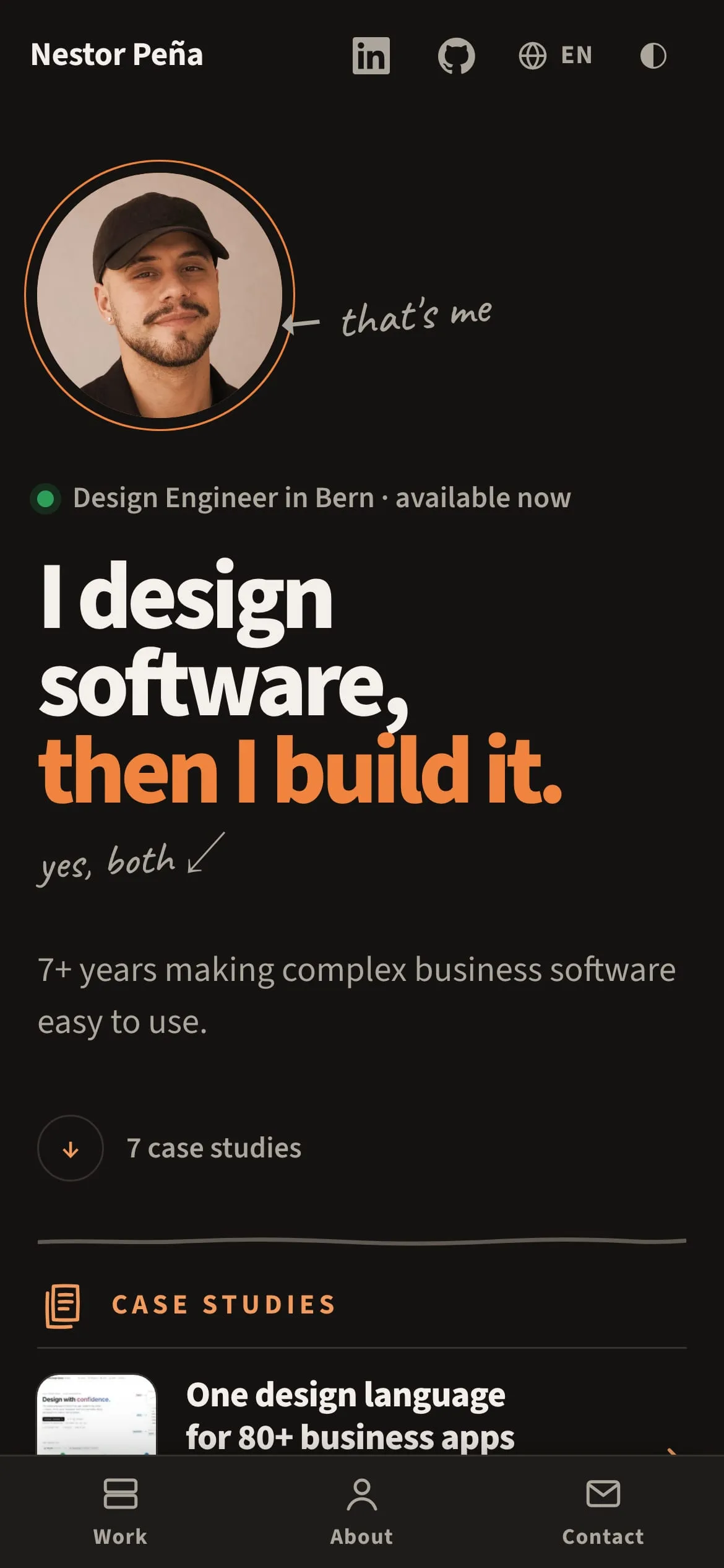
Every app and website screenshot sits in the same frame: a dark bezel, a slim browser bar with an address pill on desktop, rounded screens on the phone. The before/after sliders use the same frames, and the ECCO2 tenant-app drawings use the phone.
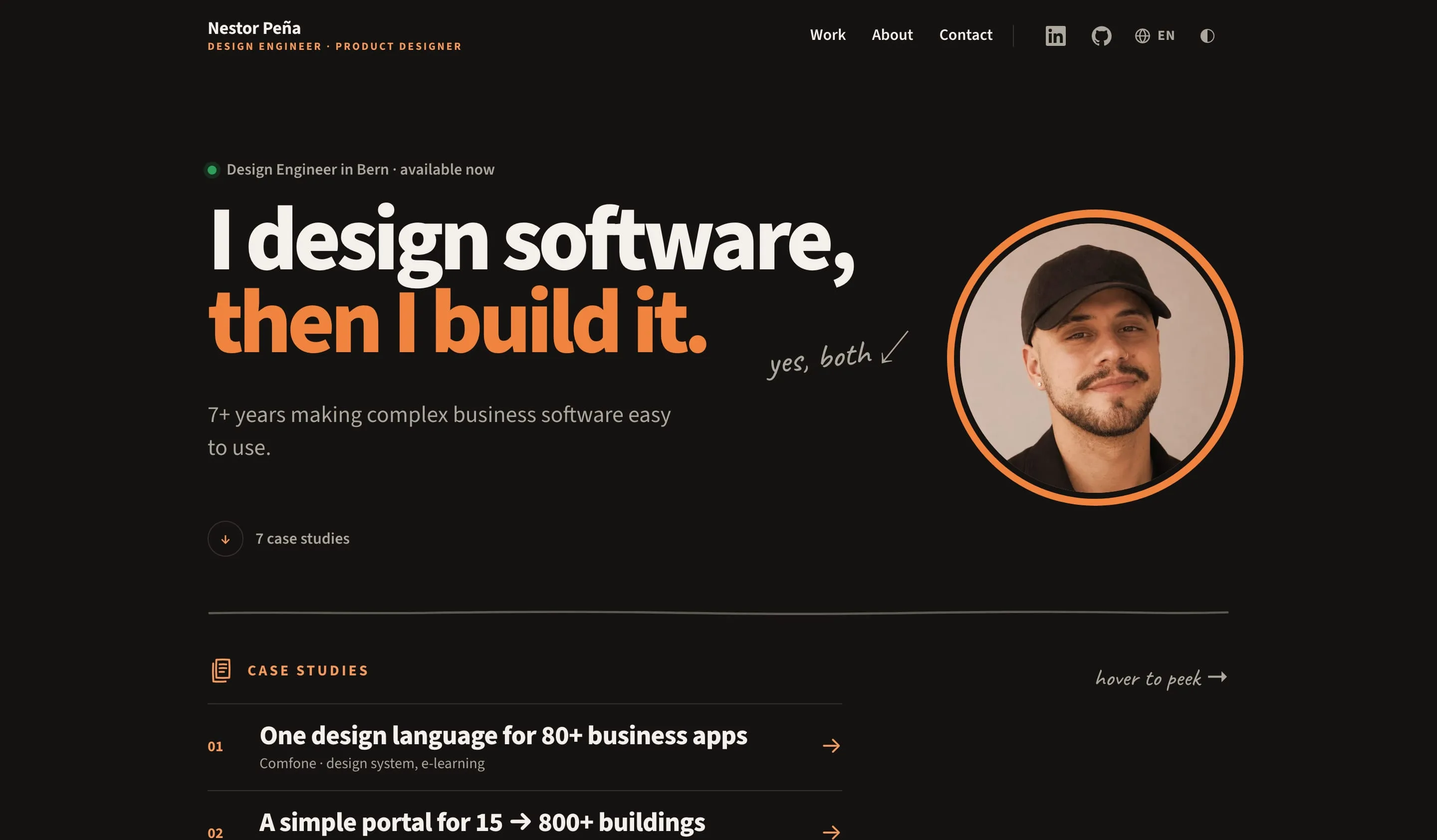
This site's home page inside the desktop frame
device=desktop · --device-bezel, --device-chrome, --r-device-desktop
This site's home page inside the phone frame
device=phone · --r-device-phone

Client logos

Logos are drawn in the ink colour so they sit quietly in both themes. Brand marks keep their colour (Comfone's flag, the red "Bern"). Hairline outlines get a fixed 1.3 px stroke so they stay legible at header size.

Work index

The Home list leads with the work, not the client: a one-line title, then client · role underneath. On desktop each row is one line and hovering shows a preview with a handwritten note; on touch screens the row carries a 64 px thumbnail and the note instead. Seven projects fit in under one screen on desktop and about one on a phone.

Navigation and Home

  • Mobile tab bar. Work, About, Contact on a raised surface panel (--surface, top rule, --shadow-tabbar); the current tab gets the accent label and a 3 px accent marker.
  • Language switcher. A globe and the current code (EN, ES, FR, DE) next to the profile links; it opens a small surface panel (--surface, --shadow-peek) listing each language in its own name, current one in --accent-text. It is a plain <details>, so it works without JavaScript, and it keeps you on the same page in the other language. English lives at the root, the others under /es, /fr, /de; no automatic redirect.
  • Header in two groups. Page links (Work, About, Contact) as text, a hairline divider, then one quiet icon group: LinkedIn, GitHub, language and theme, each a 44 px target in --ink-2 that fills with --surface on hover. Profiles appear again in the footer and the contact blocks.
  • Tooltips. Icon buttons and key actions explain themselves on hover and keyboard focus: an ink chip with --bg text, 13 px. They are visual only (the button's own name is what screen readers hear), Escape hides them and the pointer can move onto them (WCAG 1.4.13). Touch screens never show them.
  • Favicon everywhere. The orange N on ink as SVG, PNG and ICO, a 180 px Apple touch icon, and a maskable icon in the web manifest for Android home screens.
  • Tools and languages. Under the case studies, the tools are grouped as the same chips as Built with. A search (“type the tool you're hiring for”) lights up matches in the accent and fades the rest, then answers in plain words: where the tool was used and which case studies show it. Without JavaScript it is simply the full list. The six languages follow, each with a handwritten greeting.
  • Home hero. One status line, the two-line headline, one sentence and the portrait in its accent halo. The portrait appears once per page; the About teaser below uses the Abailar teacher photo, and the About hero uses a second, everyday photo by a mountain lake in the same halo, so the two pages never open on the same face.

Case study budget

  • One minute, measured. Every case study reads in a minute or less, in all four languages: visible words at 230 per minute plus 3 s per image, not counting the Thinking layer or interface labels. The build computes it from the finished page, prints it in the header and warns when a page goes over.
  • Shape. The same five sections everywhere: context, decisions, what I built, impact, and, in the Thinking layer, what I'd do differently. Lead under 20 words, short proof labels, one line per section; the reasons live in the Thinking layer.
  • Built with. Every header lists the tools and technologies as small chips under the lead, so the stack reads in a second.
  • Arrows stay text. Diagonal and two-way arrows (↙︎ ↗︎ ↔︎) carry a text-presentation selector, otherwise iOS draws them as emoji.

Images

  • Sharp on every screen. Each image is generated in widths up to its own native width (480 → 2560), so retina and 3× phones get real pixels and nothing is upscaled.
  • One format, one quality. WebP at quality 82; only the size each screen needs is downloaded.
  • Originals, not copies. Previews use the full-resolution source; screenshots are captured at 2× (desktop) and 3× (phone).
  • One grade for photos. Every photograph, mine and clients’, gets the same grade built from the tokens: shadows lean to --ink, midtones to --accent, highlights to --bg, with softer saturation (cool blues most) and a gentle S-curve. scripts/grade-photos.mjs writes it from the untouched originals.
  • Loaded only when seen. Images below the fold load lazily, images above it load right away. Decorative images that only one kind of screen shows (Home peek previews, phone thumbnails, the contact avatar) are CSS backgrounds, so the other screen never downloads them. Alt text never says “image” or “photo”: screen readers already say it.
  • Show the design, never the content. Documents on the site are skeletons: every line of text becomes a soft bar the length of that line, in the text's own colour, and only the name, title, status and section labels stay. Unlike a blur, there is nothing underneath to zoom into. scripts/document-shots.mjs renders the CV and letter this way.
  • Screenshots stay true. Interfaces, mockups and social graphics are never graded, so the work keeps its real colours.

Applied to documents

The CV, rebuilt with the site tokens. The name comes first, then the title in tracked accent caps and the status line from the Home hero. The portrait sits in the same ring, the contact line and every section label sit between two hairlines, and the page is the site's off-white, so the CV reads like a printed page of the site.

Nestor Peña

Design Engineer | Product Designer

Available immediately·Swiss C permit

Bern, Switzerlandwww.nestor-pena.chlinkedin.com/in/nestor-penagithub.com/npenalopez

Design Engineer with 7+ years making complex business software easy to use. I design and build, so ideas become testable prototypes in days: 30+ in four years at Comfone.

Experience

Product Designer at Comfone AG in BernAug. 2024 – Oct. 2026

Led design for Comfone's customer platform: 80+ applications, 8 product lines, reporting to the COO.

References, work certificates and diplomas: nestor-pena.ch/documents

Design notes

Hero headline options

  1. "I design software, then I build it." Picked. Seven words, says both halves of the job, and a recruiter can repeat it.
  2. "No handoff. From Figma to production, one person."
  3. "Mockups are a promise. I ship the product."

Why it's built this way

  • 60-second skim. First screen: role, status, CTAs, face, five proof numbers.
  • Thinking layer on every case study. Result mode stays a one-minute skim. The toggle adds margin notes, sketches, rejected options and the detail behind each choice, and turns the page into dotted notebook paper.
  • Decision cards, two depths. Result shows the topic and the choice; the Thinking layer adds A and B struck through, the reason and the trade-off.
  • A live demo instead of screenshots for the e-learning platform: audience toggle, ⌘K, progress.
  • One accent, two strengths so orange text passes AA at every size.
  • Motion is additive. Nothing animates on load, so the first paint is the final one; reveals only play on content scrolling into view, and switch off under reduced motion.
  • Readable without JavaScript. Static HTML with three small React islands; the Thinking layer is a radio group styled with CSS.
  • Private documents checked on the server. A Cloudflare Worker checks the access code; the PDFs are never public.
  • Four languages, one source. English, Spanish, French and German. Interface strings in one typed file per language; each case study translated as its own Markdown file that only holds text, so images, order and stack stay in one place. A missing translation falls back to English, marked as English.
  • One-minute case studies. A recruiter skims; each header says how long it takes.
  • A hand-drawn layer for character. Handwritten notes, pen-line dividers and doodle icons on section labels, so the site reads like a sketchbook, not a template.
  • WCAG 2.1 AA, said out loud. The footer of every page states the standard and links to how it's checked.
  • Checked on every push. Types, contrast of every token pair, accessibility in both themes and Lighthouse 95+.