Nestor PeñaDesign Engineer · Product Designer

Case study 07 · My own brand · 20261 min read

One design system for my website, CV and cover letters.

I designed my CV and this site as one product, and built the site myself.
Built with
  • Claude Design
  • Claude Code
  • Astro
  • React
  • TypeScript
  • GitHub Actions
  • Cloudflare Workers
3media, one system
1accent colour
1 minper case study
AAWCAG 2.1
View mode

Showing the result. Switch on the Thinking layer to see how I got there.Showing margin notes, sketches and the options I rejected.

Before / after · drag to compare

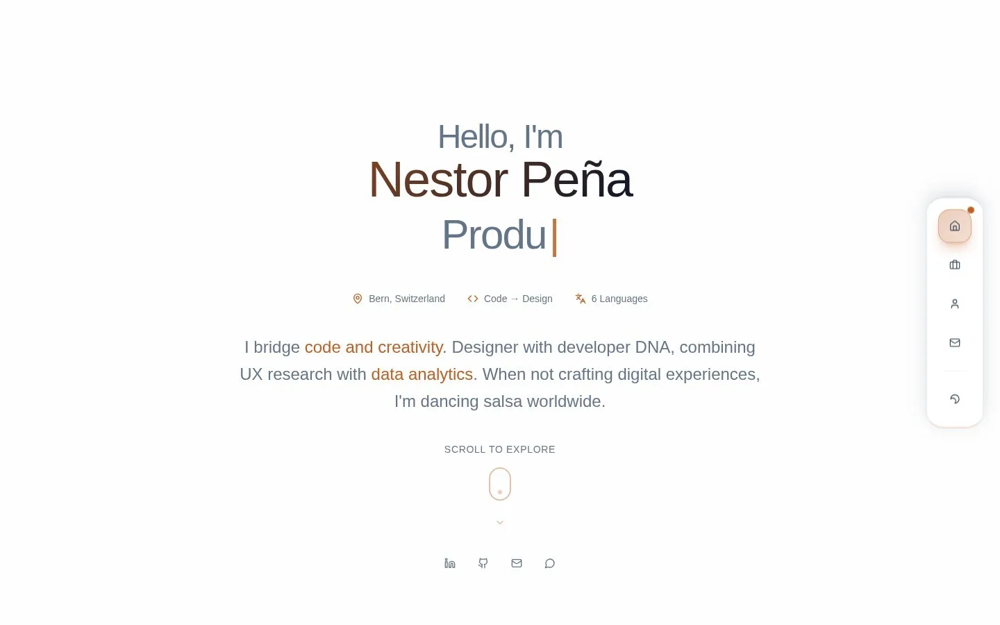
Current nestor-pena.ch home page: I design software, then I build itAfter
Previous nestor-pena.ch home pageBefore

Context and role

the CV came first

For founders, CTOs and recruiters who skim.

My own site, CV and letters, built with Astro, React and TypeScript on Cloudflare. Recruiters see the CV first, then click through, so the switch should feel like turning a page.

How I thought about it

every choice serves the skim

Starting point

Design the site, restyle the CV
A new brand

Grow it from the CV

The site should feel like the CV’s next page.

Reading time

Full write-ups
Only screenshots

One minute, depth on demand

A recruiter skims the result; the Thinking layer holds the reasons, rejected options and sketches.

Private documents

A password in the browser
An emailed PIN

A code checked on the server

The PDFs are never public, and recruiters type the code from my CV.
What I built

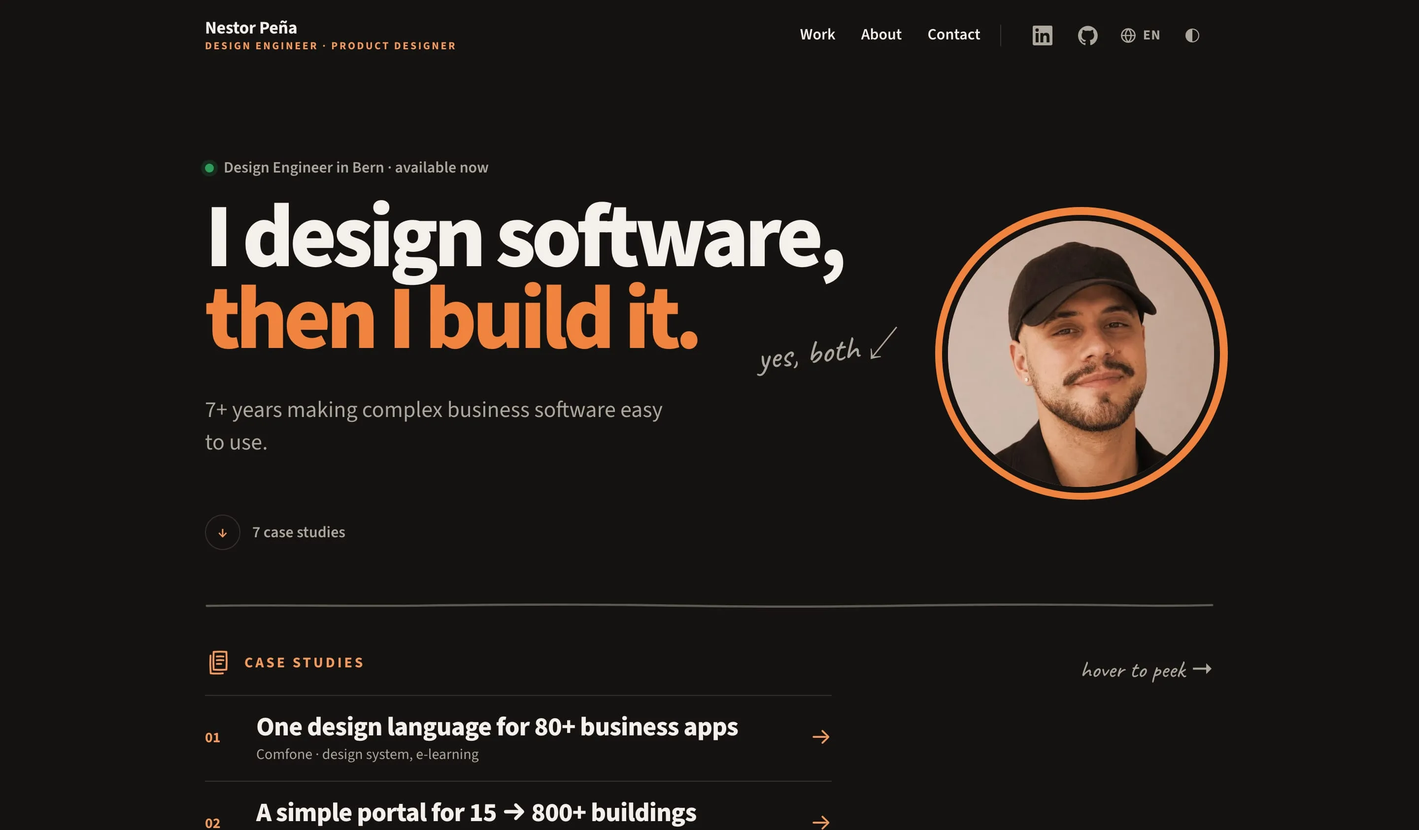
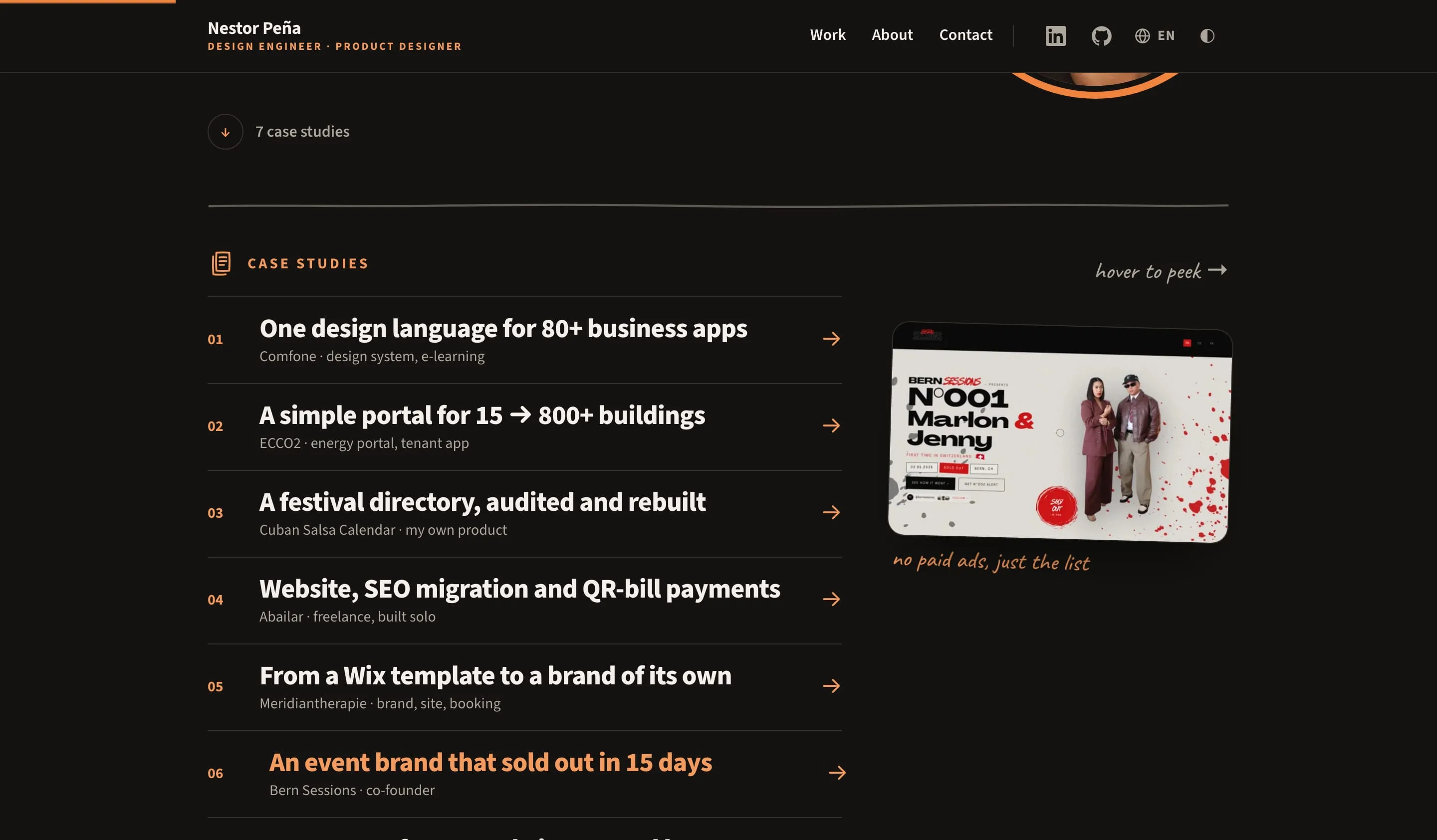
Case study index on the home page: seven one-line rows, with a hover preview of the Bern Sessions case and its handwritten note
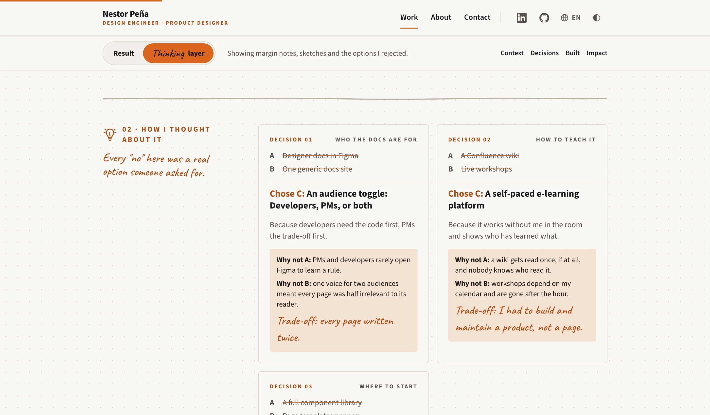
Pulse case study with the Thinking layer on: dotted paper background, margin note and decision cards showing why options A and B were rejected
The Thinking layer
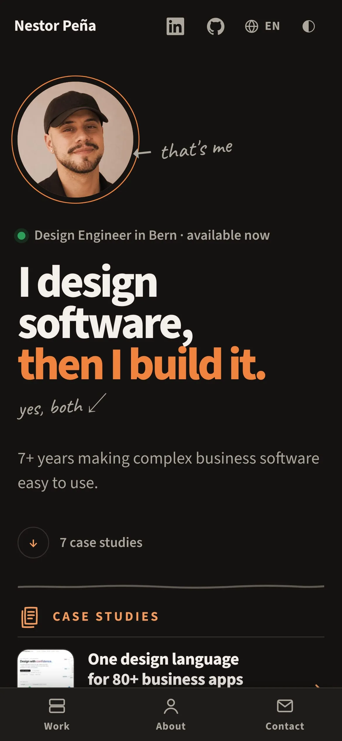
Home on a phone: portrait, short headline and the raised bottom tab bar
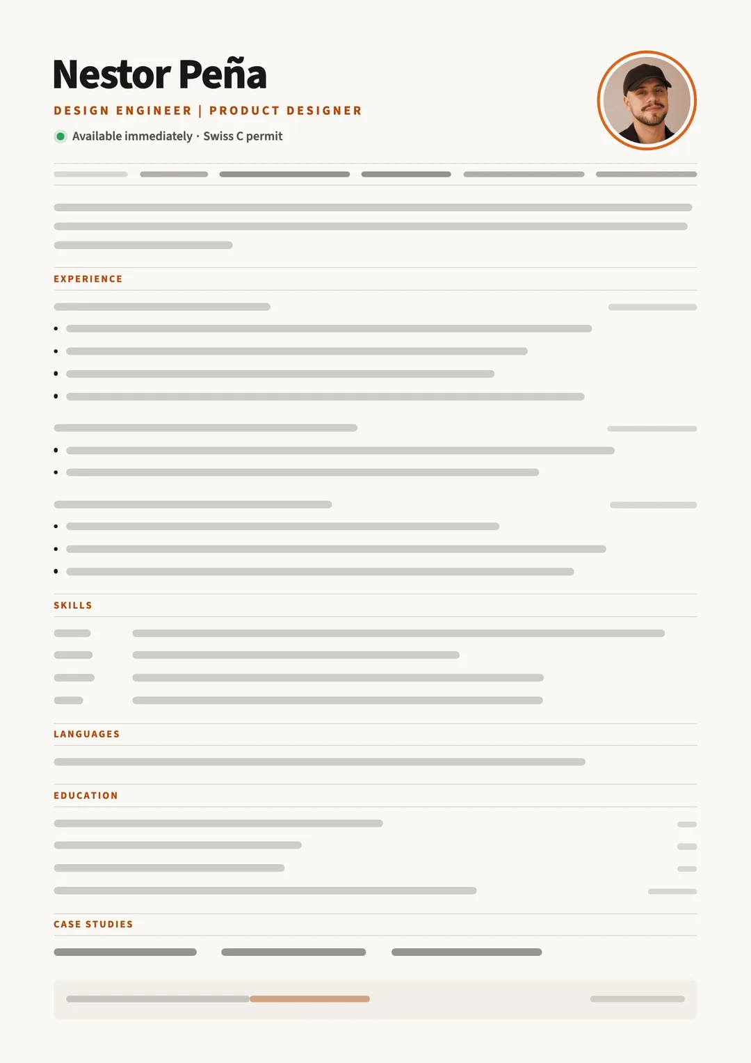
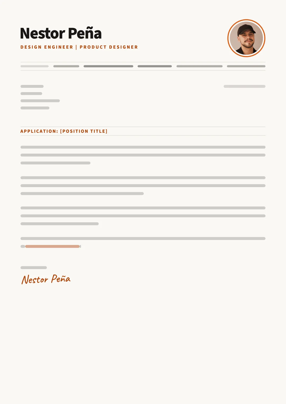
CV page as a skeleton: name, title and section labels, with every line of text replaced by a bar
CV
Cover letter page as a skeleton: name, title and subject, with every line of text replaced by a bar
Cover letter
  • One token file drives the site, the identity page and its contrast ratios.
  • One Markdown file per case study: the page, Home row and preview image follow.
  • A Thinking layer on every case study: margin notes, rejected options, sketches.
  • A hand-drawn layer: notes, doodle icons and pen-line dividers.
  • A tool search for recruiters: type “Jira” or “Azure DevOps”, get a yes and where I used it.
  • Four languages: English, Spanish, French and German; the switcher keeps you on the same page.
  • WCAG 2.1 AA, checked on every push: contrast, accessibility, types, Lighthouse.
  • A calm header: page links, then one quiet icon group for profiles, language and theme.
  • Tooltips: icon buttons explain themselves on hover and keyboard focus; Escape hides them.
  • Favicons for every device: browser tabs, iPhone and Android home screens.
  • One colour grade for every photo: ink shadows, accent midtones, cream highlights; screenshots keep their true colours.
  • A CV that applicant tracking systems can read: one column, name first, and every PDF checked the way an ATS parses it.
See the identity system →

Impact

95+Lighthouse, every page
0accessibility violations
1minute per case study

Measuring kept finding what mockups hide: colours below AA, half-resolution images, a crash in the demo. All fixed.
What I'd do differently

  1. Test the home page with two or three recruiters before launch.
  2. Share one token file between the site and the CV tool.

Want one system across your product?